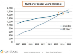
The importance of mobile is already well understood by most business owners. More consumers than ever are now browsing the web from mobile devices. Smartphones are so ubiquitous that you would be hard pressed to find someone without one. According to data from comScore, global traffic on mobile devices has surpassed traffic on desktops:
An increase in mobile usage has also led to a dramatic increase in online searches. Last year, Google released a major update to its ranking algorithm that favors mobile friendly sites in the mobile search results. Not adhering to the guidelines means that your site could appear lower for users on mobile devices.
More than a year later, Google is moving towards a mobile-first index.
Previously the ranking algorithm would prioritize the desktop version of a site to determine its relevance. But for mobile users, the site would naturally return a mobile page that may be different or have less content. So moving forward the search index will now primarily comprise of mobile pages to improve the browsing experience.
Google made the following announcement on the Webmaster Central Blog:
To make our results more useful, we’ve begun experiments to make our index mobile-first. Although our search index will continue to be a single index of websites and apps, our algorithms will eventually primarily use the mobile version of a site’s content to rank pages from that site, to understand structured data, and to show snippets from those pages in our results.
The new changes will certainly have an impact for businesses that rely on search engine traffic. Here we look at how to prepare your site for a mobile-first index.
Run a Mobile Friendly Test
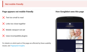
The first order of business is to determine if your site is mobile friendly. This is rather straightforward and there are plenty of online tools available. Simply enter your URL into Google’s Mobile-Friendly Test for an analysis.
If your site is not yet mobile friendly, then you will see the following:
If your business has yet to make the change to mobile, now is the time to do so as Google will start to place more value on mobile pages. Even if your site is already mobile friendly, there are some additional things you need to check to ensure your business is prepared for the next major update.
Go Mobile With a Responsive Design
People use all kinds of devices to browse the web including smartphones, tablets, and desktops. Building a site for each device is not only impractical but also a waste of resources. This is where responsive design comes in.
Responsive design is a grid like structure which allows sites to dynamically change to fit all screen resolutions.

Responsive design is actually Google’s recommended configuration to meet all mobile requirements. It also offers a number of SEO benefits and makes it easier for Google to crawl and index your pages.
Here are additional tips for a better mobile browsing experience:
- Avoid using Flash: The use of Flash may have been popular in the early days of the Internet. But now it is largely obsolete and a number of mobile devices (including iPhones) are unable to view Flash content. Instead, use HTML5 or Java to display animations.
- Eliminate pop-ups: Nothing is more frustrating than landing on a page only to be presented with a barrage of advertisements and pop-ups. Either eliminate pop-ups from your site altogether or reduce their usage.
- Improve site performance: Mobile users are typically on the go so they expect pages to load quickly. Optimize images and take other steps to improve loading times. Otherwise you risk visitors quickly bouncing out.
- Put important information above the fold: Mobile users also expect to find the information they want without having to dig through pages and pages of content. So make sure you put important details above the fold (e.g. contact details, etc.) and keep your content short.
Run Structured Data and Robots.txt Tests
Structured data markups refers to types of data that Google can organize and index.
One example is using structured data markup for recipes such as a brief summary, URL, and overall rating. Google can then take this information and display it in creative ways such as for rich snippets in the search results.
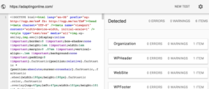
First, run structured data tests for your site and compare the output. If the structured data markup for both the mobile and desktop versions of your site are equivalent, then you likely won’t need to make any changes. But you will need to fix any errors that might be displaying.
It is also a good idea to test the robots.txt file to the robots.txt Tester tool to ensure that the Googlebots are able to access and index the mobile version of your site. If the text reveals that your site is blocked, you will need to edit the robots.txt file and test again.
Finally, login to your Search Console account to verify your mobile site. Simply click on Manage Property and Verify This Property. Then you will be asked to choose a verification method.
Final Points
It is clear that Google is prioritizing mobile with the mobile-first index. But building a mobile-friendly site and meeting all the requirements is still only the first step.
Here are additional tips to improve the visibility of your site for mobile searches:
- Optimize on-page factors: Make sure to include your target keywords in your page title, headers, and throughout the content. Remember not to overly stuff your contents with keywords as doing so may result in a ranking penalty.
- Optimize for local searches: For local businesses, it is essential that your business name, address, and phone number are clearly visible. It is also a good idea to include the target keyword with the city to rank higher for local searches.
- Build relevant links: Links still continue to carry a good deal of weight in terms of search engine rankings. In addition to preparing for the next mobile update, you should also be focusing your efforts on building quality links from relevant sites to increase your rankings.
Take each of the steps as outlined here to prepare your site for Google’s mobile-first index.