Your website is perhaps the most valuable marketing asset.
Visitors to your site can learn more about your business and make a purchase or fill out a lead form. But your site needs to be professionally designed to have any chance of converting visitors. Potential prospects are quick to make impressions and will not hesitate to leave a site if it fails to meet certain expectations.
Research from the Nielsen Norman Group has shown that the average visit to a webpage lasts anywhere from 10 to 20 seconds. Those first few seconds are absolutely critical then as to whether a visitor will stay or leave. So how can you increase engagement and reduce bounce rates?
The answer of course is with a well designed site.
Often we see small business owners throw up clumsy websites and they wonder why conversions on their pages are practically nonexistent. But in truth that decision has largely led to a weak link in their marketing efforts.
Here we look at some of the most common website design mistakes and suggestions to fix them.
1. Cluttered Webpages
Too much clutter is overwhelming.
Most online users simply will not tolerate sites that are difficult to navigate. Visitors expect to find the information they are looking for within the first few seconds of landing on a webpage. One mistake many businesses make is cramming too many elements above the fold, resulting in a cluttered design.
Here is an example of a homepage with too much clutter:
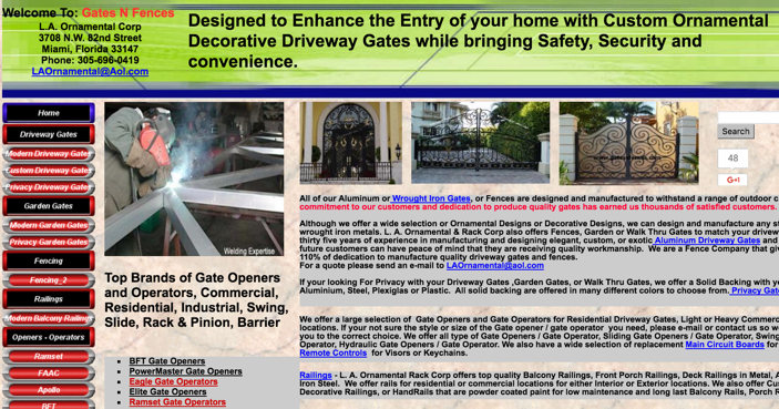
Right away it is difficult to tell what the business even offers. There is a good chance that bounce rates to this site is unusually high. Websites with loads of images, text, and other elements are not only confusing to visitors, they also dramatically slow down loading times.
Suggestion: Avoid designs that are too cluttered. Make ample use of whitespace and use a legible font that is easy to read. Keep the most important information (e.g. address, phone number, business hours, etc.) above the fold.
2. No Clear Call to Action
No need to be subtle.
Sometimes visitors need to be told exactly what to do whether that means adding a product to their shopping cart or signing up for a newsletter. Often we see well designed sites but they are missing one key component: the call to action.
The lack of a call to action means that visitors are less compelled to take the action you want them to. A call to action is simply an instruction for visitors to take such as:
- Try a free trial of our product
- Sign up to our newsletters
- Click to download an ebook
- Fill out the form to
- Call for a free quote
Here is an example from the homepage of Shopify:
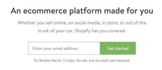
Adding a call to action to your pages can dramatically improve conversions.
Suggestion: Include a call to action on each page, especially your main product or service pages. Make sure that it is clearly visible with a large font and contrasting colors. Test different offers to determine which one converts better.
3. Not Optimizing For Mobile
Mobile usage continues to rise year after year.
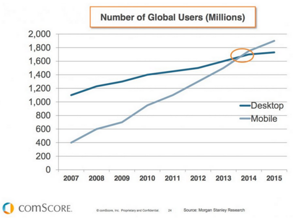
Try to find someone without a smartphone and you would be hard pressed to do so. The reality is that more consumers than ever are now browsing the web thanks to advancements in mobile technology. And according to data from comScore, traffic from mobile devices has overtaken traffic on desktops.
Google has even rolled out a global update to make mobile friendly sites more visible in the mobile search results. So your site could be ranking lower if it doesn’t meet all mobile requirements.
The implications are clear: Your site needs to be optimised for mobile devices. Otherwise you risk losing potential sales to visitors leaving your site in frustration because it wasn’t optimized for mobile.
Suggestion: Make mobile a priority if it isn’t already. Responsive design is Google’s recommended configuration which means that sites dynamically adjust to fit all screen resolutions from desktops to tablets and smartphones.
4. Weak SEO
An engaging web design is certainly critical to convert visitors into customers.
But your site also needs to be optimized for search engines.
A survey from Google has found that 4 out of 5 consumers use search engines for local business information such as phone numbers and directions. But those visitors won’t be able to find your site unless it is visible in the search results. Even then, your site would need to rank at least on the first page for your target keywords to generate traffic.
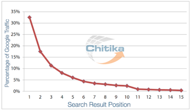
Data from Chitika has found that the first page attract the majority of all clicks.
So even with a beautiful design your site still needs to incorporate basic SEO principles, something that we see a lot of small business websites lack.
Suggestion: Optimize all on-page factors including your title tags, meta descriptions, and content for your target keywords. If your business is locally based then make sure that your business name, phone number, and address are clearly visible. Building links from authority sites can also help your pages rank.
Conclusion
Your website is a valuable asset that can drive more sales to your business.
But how your site looks and functions matters much more than you think. Because online users will not hesitate to leave your site if it fails to meet their expectations. From cluttered designs to mobile unfriendly sites, these are the type of mistakes that could be costing your business sales. Addressing each of them can dramatically boost conversions.