You’re on your smartphone and you need to look up information. So you do a quick search and find a result that matches what you’re looking for.
But the site is a complete mess.
The text is too small. You can barely tap the right links. Worst is the fact that you need to scroll horizontally to see the rest of the page. Some components aren’t even loading at all.
Sound familiar? This is an example of a site that is not optimized for mobile devices.
A study from comScore found that we now spend more than 50% of our time consuming digital data within mobile applications.

Mobile Stats
As more consumers use smartphones and tablets to connect online, a mobile friendly site is a critical component of building a strong brand online. Here are the steps to make your site mobile friendly.
1. Run Your Site Through the Mobile-Friendly Test
Google has an online tool that lets you check if your site is mobile friendly. Simply enter the URL of your site and click Analyze. If your site is mobile friendly, you’ll see the following:
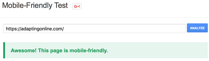
Mobile Friendly Webiste Test
Your site will need a major overhaul if it fails the test.
2. Choose a Mobile Configuration
If your site isn’t yet mobile friendly, there are three different formats to choose:
- Responsive: Responsive design involves flexible grids that dynamically change to accommodate any screen resolution. This is actually Google’s recommended configuration. It also offers numerous SEO advantages.
- Dynamic Serving: Allows you to serve different HTML and CSS. Doing so offers a full mobile experience but generally requires higher maintenance.
- Separate URLs: A completely separate mobile site that has its own URL and HTML. The problem with this approach is having to manage two completely separate sites.
So which configuration should you choose?
Each has their pros and cons that need to be weighed carefully. Which one you choose ultimately depends on your business and the mobile experience you want to deliver to end users. Regardless of the approach you take, your site needs to be mobile friendly.
3. Follow Mobile Best Practices
Google now has a mobile friendly label for sites that meet all requirements which looks like the following:
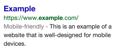
Mobile Friendly Website Example
The change has already rolled out globally. But having the label on your site requires the following criteria:
- Avoid using uncommon software such as Flash
- Use text that is readable without zooming
- Ensure the page sizes content without scrolling horizontally
- Place links far apart to aid tapping
As long as the Googlebot detects that your site meets these requirements, your listing will have a mobile friendly label in the search results. Depending on which software your site uses (e.g. WordPress, Joomla!, Drupal, etc.), there are dedicated guides available to get you on the right track.
Conclusion
Mobile matters.
A site that isn’t optimized for mobile devices delivers a poor user experience. Google released a major algorithm update earlier this year that makes mobile friendliness a ranking factor. The deadline to make the transition has already passed but Google will automatically re-crawl and index your site once its meets all mobile requirements. If your site is not yet optimized for mobile, now is the time to do so.